Showing posts with label Infographic. Show all posts

Friday, October 19, 2012

The War Horse

This project is the brainchild of our Graphics Editor Bonnie Berkowitz who, some three weeks ago, saw the potential for a big piece for our Sunday Arts section.

War Horse, the Tony Award winner play based on Michael Morpurgo's novel was coming to the Kennedy Center on October 23 and the fact that the main character of the show was a life-size puppet created by the Handspring Puppet Company of South Africa, seemed like a great opportunity to create an explanatory infographic for our readers.


Final double page


Given the bizarre and unconventional appearance of the puppet, I decided to start working first on the cover illustration for the section so I could familiarize myself with the creature. I used ink pens of different widths for the outlines and then applied washes of watercolour.   


Cover illustration
Creation stages of cover Illustration

The overal design of the infographic had the usual central theme which I planned to use as a visual guide to explain how then puppet was operated and as a map for a series of diagrams pointing to some crucial mechanical components of the horse. The graphic also would include two secondary components: a description of several configurations of the puppet and a timeline, discussing the evolution of several puppets created by Handspring that, ultimately, inspired the creation of Joey.


Production sketch

The main component of the graphic was created on a 20 x 25 in rigid board with the same technique than the cover Illustration. 

  
Main illustration

At this point, I also decided to give the graphic certain appearance of age, by creating a background  imitating a worn off fabric texture. The idea was originated by the fact that the War Horse puppet exterior is made of cane and cloth.


In order to keep a stylistic coherence acros the whole piece, I decided to go for a hand-drawn feel for the whole graphic.


Diagrams


That was also the case for all the secondary illustrations.

Secondary Illustrations


A high resolution copy of the infographic can be found here; an interactive version here and a photogallery detailing the creation process of the piece here


Monday, August 6, 2012

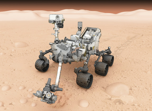
Curiosity Mars Rover


Curiosity Mars Rover, originally uploaded by petrus01.

I did this one last year and thought that today, the day that Curiosity finally landed safely in the surface of Mars, is a perfect time for a refresher. This piece was a pet project of mine for a long time and was lucky enough to have literally months develop it. The model of the rover, is one of the most complex I've ever created, hugely benefited from the collaboration of JPL that provided me with all kinds of reference.


The motion graphic was created simultaneously with the talented Emmy winner Sohail Al Jamea, a work of art  that we tweaked for weeks until we were almost happy with it.


Tuesday, July 17, 2012

Olympic timing


Olympic timing, originally uploaded by petrus01.
Standalone graphic for the Health and Science section explaining how the time keepers figure out who wins at the Olympics. Vector work created in Illustrator and side illustrations done in ink pen and watercolour.

Friday, June 8, 2012

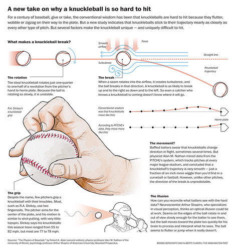
Knkuckleball explainer


Knkuckleball explainer, originally uploaded by petrus01.
Apparently knucleballs don't "float" around like in a cartoon. It was fascinating learning the particulars of the physics of this kind of pitch and a lot of fun to get to draw R.A. Dickey's very own particular grip.


Monday, June 4, 2012

How bodies beat heat


Heat, originally uploaded by petrus01.
Infographic for the Health and Science Section explaining the mechanisms used by the human body to adapt to high temperatures. I used ink pen and watercolour elements to enhance and stylize the graphic.

Tuesday, March 6, 2012

Slam dunking


Working in this graphic I learned out that slam dunking is more a question of strong buttocks muscles than height, although the later does help. With the info harvested by Bonnie we were able to build this one in a little more than a couple of days.


The dominant illustration was created with an ink pen and then scanned and colorized in Photoshop with a Wacom Intruos.


We also had time to build an interactive version. Sisi Wei created the basic template in which we constructed a simple stepper.

Tuesday, January 24, 2012

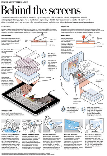
Touch-screens explained


Touch-screens explained, originally uploaded by petrus01.
Traditional isometric vector explainer for the Health & Science cover of today's paper. It's ben a while since I've done one of these. Here'e the WaPo online link.

Tuesday, May 3, 2011

The thin line between fact and speculation

In any reputable Visual Journalism operation there's only one commandment that really matters: "thou shall never speculate." It's the unwritten law that sets apart illustration from information graphics by its very definition. However, every time major breaking news coverage erupts, the temptation of creating speculative pieces is powerful and enticing, just like the Dark Side of the Force.
I know, it is a very thin line, so very easy to cross. Even easier when there's lots of space and expectations to fill.
Today, after taking an initial look at a limited number of examples of the coverage of Osama bin Laden's death by newspapers and newspaper's websites, I observed three basic classes of graphics:

Class A: Infographics with no deviation whatsoever from the known information.

Let's start with my home turf, the Washington Post

The Washington Post A1
The WaPo went with a simple, austere and elegant 3d diagram created by Todd Lindeman, based on official information released by government sources, and photographic reference. The graphic's text sticks to the known and confirmed facts and avoids any deviation from the norm.
The interactive version also adds some 3D cartographic context a timeline and description of traditional Muslim burial practices. All of those elements are in sync with the overall coverage of the story.

New York Times Interactive
The New York Times opted to follow almost the exact pattern. Once again, a clean-cut — but well-done, on-script render — of Osama's compound, a 3D cartographic terrain map and a timeline.  The online version also includes the usual photo-flipper with images of the operation's scene.

Boston Globe interactive
I have had no access to a copy of the Boston Globe today, but judging by its interactive Javier Zarracina's team also went with a similar approach. The infographic sticks to known facts and adds  some very elegant and cool animation textures here and there, making their version fun but without sliding into "Imaginationland".

For what I've seen so far, most US papers pretty much followed the same basic design in their information graphics and visual coverage of the incident.

Class B: Infographics with some speculation but mostly based on the known facts.

The team of the Spanish diary El Mundo fall into this category with their double truck.

El Mundo's double truck
 The team  directed  by Juantxo Cruz created an attractive and well researched all-in-one piece that lacks of nothing: a detailed description of the typical gear of a Navy SEAL, a step-by-step description of DNA-based identification, timeline and a "reconstruction" of the attack. 
El Mundo's piece entered speculation territory by describing the location of the helicopters, its layout operation and, of course, the "reconstruction" of the shooting inside Bin Laden's room.
Interesting enough is their interactive: no extra sauce there, just a locator and the official diagram of the complex.

El Pais graphic
Also in Spain, El Pais took it a notch further by not only showing the battle order of the operation, the exact location of U.S. troops and helicopters, but also the precise position of Bin Laden's men around the complex. I was also surprised to discover how a mountain range suddenly appeared just a few yards from the complex when pretty much every satellite image of the area shows flat terrain.

Infographic speculation was not only the realm of some European papers. Thompson Reuters, the veteran, reputable wire agency also added some "pizzaz" to their world coverage:


On that note, one detail I really liked from European papers is the inclusion of a diagram of a SEAL in full gear, like this one from Liberation:

Liberation graphic
I was also positively surprised to see how Le Monde was already a day ahead with a graphic about the network of different Islamic extremist organizations worldwide.


Class D: What were they thinking?

Just a couple of fun examples in this category.


Graphic from The Daily Mail
The London tabloid Daily Mail, which sells millions of copies, went full commando with this "jewel" that defies any definition as an information graphic but it's a lot of fun to look at. Please note the totally useless arrow below one of the Black Hawks, the exchange of heavy phaser fire between "bad guys" and The Avengers and the diagram explaining how Chuck Norris single–handedly shoots down Bin Laden, his wives and his escort, after kicking down the room's door. It's all there. Really.

Another Pièce de résistance comes from from UOL, a major internet service provider in Brazil. Under the title: "Learn how the U.S. operation to kill Osama Bin Laden happened" the site offers a slideshow of napkin sketches that describe sequentially the order of events.


Update: My friend Ninian Carter, who also happens to be a veteran Visual Journalist has posted today a huge selection of graphics on the same topic on his blog  GraphicGibbon.  Also a must-read is Charles Apple's in-depth and exhaustive analysis of how most of U.S papers treated the raid on Bin Laden's complex.

And just one more thing....

a fellow visual journalist Sarah Slobin made last night a very good point: what about the actual reporting in our graphics? Even with handouts and official information pouring all around us there's also the duty, as journalists, to compare those with our own souces.
Graphic from The Wall Street Journal
The Wall Street Journal clearly reflects this principle. Not the prettier of the bunch, but the graphic does offer quality reporting. As Sarah explains they "paired the briefing material with additional reporting" nailing down details like which floor Bin Laden was on, and "omit other details" they thought were too sympathetic, such as where the women and children were sheltered when the helicopter was destroyed.http://www.lemonde.fr/mort-de-ben-laden/infographie/2011/05/03/la-carte-des-reseaux-terroristes-islamistes_1516115_1515627.html

Friday, April 29, 2011

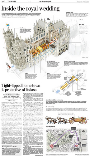
Looking back at the Westminster Abbey project


Royal Wedding, originally uploaded by petrus01.
Or graphic about the British royal wedding was finally  Thursday's paper closing two intense weeks of work in this project.
Some details: the building is Lightwave 3d model created in some 500 hours with a 600k final poly-count. I used mostly pictures and aerial views as reference but managed to find some simple frontal elevations and floor-plans that were used as scale.
The final image is the usual multipass sandwich: colour, occlussion, alpha...etc put together in Photoshop were several adjustment layers were applied to give the diagram the desired "sketchy" look.
The carriage illustration was created by our in-house motion graphics dude Sohail Al-Jamea in Autodesk Maya. You can take a look at some examples of his incredible work here.
The  project also includes a motion graphic/ interactive of the story. The animation has 2 basic segments. The first one, a flyby and inside look of Westminter Abbey, was rendered in Lightwave. For the second one, Sohail used Maya an its awesome organics animation tools to recreate the royal carriage motion. The whole package was edited in After Effects.
Finally, the online package was assembled in Flash by Kat Downs, who also added a very ingenious time-lapse walk-trough of the wedding parade.

Thursday, November 11, 2010

Marathon


Marathon, originally uploaded by petrus01.

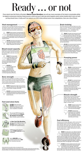
Watercolor and pen ported over to Photoshop and assembled on Illustrator as usual. Bonnie edited the text as if it were her very own baby: she's a Marathon nut, literally.